Whoever Designed the NBA's City Jerseys for 2021 Forgot the Cardinal Rule
By Liam McKeone

The NBA season is nearly upon us as it feels inevitable that the NBAPA will agree to the December 22 start date put forth by the league in an effort to recoup as much revenue as possible after the economic impact of COVID-19. In lighter news, this also means we'll be getting another year's edition of City jerseys -- the alternate to the alternate uniforms for every team in the league.
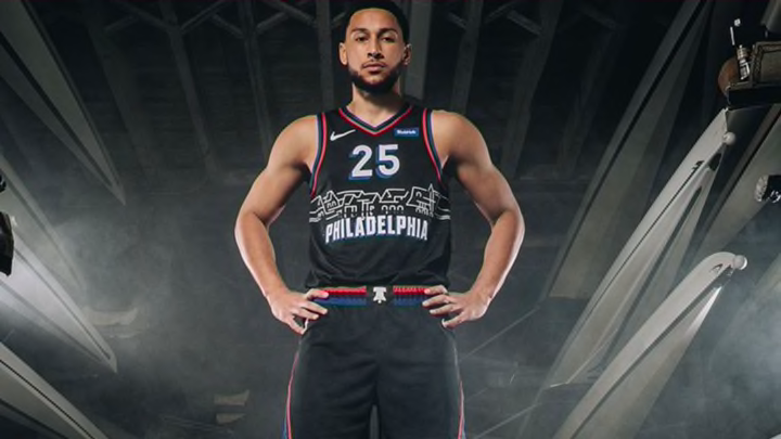
A few have already been released. The Philadelphia 76ers announced their new City jerseys via an exclusive with ESPN's Zach Lowe, while the Orlando Magic announced theirs on the team website. Here's what they look like.
The @sixers reveal their 2020-21 City Editions jerseys ?@ZachLowe_NBA talks with Ben Simmons and Iverson about the new threads.
— ESPN (@espn) November 10, 2020
ESPN+:https://t.co/ltb6IdjIvl pic.twitter.com/4YKLuh4RzR
Look, these are fine. The orange on the Magic jersey is going to brutally clash with the court but they presumably have a plan for that. Florida is the Sunshine State and loves oranges. I am not from Philly so I don't really feel strongly about the literal houses on the jersey that I am sure are an iconic skyline image. My biggest issue here is that the designers broke a simple rule: if it ain't broke, don't fix it.
The Magic and Sixers have two of the best potential throwback jerseys of all time. The all-black 76ers uniforms from the Allen Iverson days are classics. The blue pinstripe threads from the Penny-Shaq era for the Magic are in the same class. Observe!
I get that nobody wants to recycle old ideas, but it's 2020 and originality is dead anyway. No one would be upset if the City uniforms were simply updated versions of these jerseys. Because they're awesome. Yet neither team has worn them in a number of years and instead choose to trot out yearly versions of City uniforms that attempt to capture the spirit of the team's hometown with no apparent regard for its basketball history.
Also, the new Philadelphia uniforms look like the font on Philadelphia Cream Cheese. Not sure what they can do about that one.
No way it's the cream cheese Sixers. No wayyyy pic.twitter.com/EOlG7hl4RA
— Rob Lopez (@r0bato) November 10, 2020
The point is that going to the late-90s/early-2000s look for these teams is a layup, as one might say in basketball parlance. The new stuff is shiny and neat, but nothing can match these.