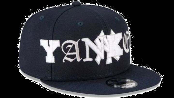
New Era's 'Mixed Font' MLB Hats Are Hard on the Eyes
By Liam McKeone

It has been a rather tough year for new versions of MLB hats. In May, the "local market" hats released by the league in tandem with new uniforms for all the teams were met with a tidal wave of criticism and laughter. Now it's New Era's turn.
Today, New Era released their "Mixed Font" hats for all 30 franchises. They are... bad! I have no idea why anyone would want to buy these. You can't even read them. God help anyone with dyslexia trying to decipher this stuff. Here's a few of the worst offenders:
Thoughts on these New Era hats? pic.twitter.com/DxkqAUaD5z
— FanDuel (@FanDuel) July 6, 2021
“Wtf is New Era doing”: Pirates Edition (thread) ?☠️?
— Kelsey ⚾️?☠️ (@11lizzie) July 6, 2021
❌ Absolutely not/Why?? pic.twitter.com/DpeQG8bg1p
While we're here, it makes perfect sense that the Pirates have a graphic design of an ocean wave on their hats. Pittsburgh, noted waterfront city in America.
Dear New Era,
— All Sports Culture (@ASCSportsMedia) July 6, 2021
These are the WORST hats ever. Oh wait, I forgot about the clipart hats that were launched a month ago ?? pic.twitter.com/4cCIupFjZo
No @NewEraCap. Just. No. ?♂️? pic.twitter.com/uyKb3eQjzb
— Daryl Ruiter (@RuiterWrongFAN) July 6, 2021
PHIL PLIES pic.twitter.com/Rhy51WORWl
— Chork (@cdgoldstein) July 6, 2021
are hat designers ok https://t.co/9nktLSl7GI https://t.co/qkEoyQee62 pic.twitter.com/aNG6p94JkZ
— Fabian Ardaya (@FabianArdaya) July 6, 2021
I mean, I can see where they started. An executive wondering out loud if they can get both the name of the team and the logo on the front of the hat. It seems the creative process spiraled out of control from there and suddenly the designers were up against a deadline and just threw it all on the same place and switched up the font and we have this. A chaotic disaster.
For whatever it's worth, most of these are sold out already, according to the site. What a year for the apparel game. I got this far without mentioning the 2021 All-Star Game uniforms on top of it all.