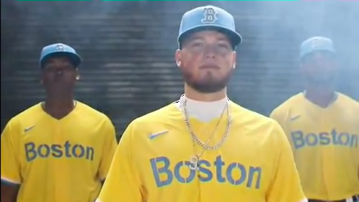
Red Sox City Connect Jerseys Are Actually Very Good
By Liam McKeone

This year, Nike worked with MLB and the 30 organizations that make it up to create City Connect uniforms for every team. It is exactly like what they have done in the NBA with mixed results. It is not easy to come up with a concept that links design to some historic part of a city while creating a color combination that looks good and ties into said design.
The Boston Red Sox became the first team to releases their City Connect uniforms today. Upon first glance, one may react negatively. I certainly did. But upon further pondering, I have decided these City jerseys are actually great.
We are ??????.@nikediamond x Red Sox pic.twitter.com/R8ZX27VUff
— Red Sox (@RedSox) April 6, 2021
I mean, it's the Red Sox and they're wearing yellow and blue. It doesn't mesh with the mental picture that is deeply embedded in the sports fan's brain.
But! The blue type with the yellow background grows on you the longer you look at it. It's clean and simple, which is often the biggest attributes of success for any jersey in any sport. And while I don't know why, exactly, these shades of yellow and blue are the primary colors of the Boston Marathon, it's obvious that the Marathon connection is what drives the design.
To compare, this is far better than the Celtics' "banner" jerseys this year that were just white with green trim or last year's abominations that featured gold numbers and text that could have been ripped straight from an Irish pub at Logan Airport. It's not what anyone expected from a Boston city-themed jersey, but it is crisp and unique and I will hear no argument otherwise.